David Swanson, from World BEYOND War, presents a new collection of maps, on subjects ranging from wars and weapons to money and law.
 By David Swanson
World BEYOND War
 A new collection of maps found here displays what militarism looks like in the world. Here’s a brief guide to using and understanding them.
Across the top are 10 drop-down menus on these topics: Wars, Weapons, U.S. Weapons, Money, Nukes, Chemical and Biological, U.S. Military, Air Strikes, Law, and Promotes Peace and Security.
Some of the topics only include one map, others multiple maps. The one with the most has eight maps. When you click on the name of a map in a drop-down menu, you’ll see that map displayed. If the map contains data for multiple years, you can see previous years by changing the date at the bottom.
You can even make it scroll forward through the years like a short video. You can select a particular country from a list or on the map. You can zoom in or out. You can click on the color key to display only the countries in a particular range of data (such as those with the highest spending on wars or suffering the highest number of air strikes). You can print any map or get a direct link to any map set to any date and other settings.
Each map has a year as part of its name. While the maps have all just been updated for 2020, the latest available data for some of them is from 2019 or an earlier year. The dates on the maps correspond to the years the data is from. None of the maps reflect any changes already brought about by or predicted or hoped for as a result of the coronavirus pandemic.
Here’s a bit of information about each topic that has been mapped.
Wars
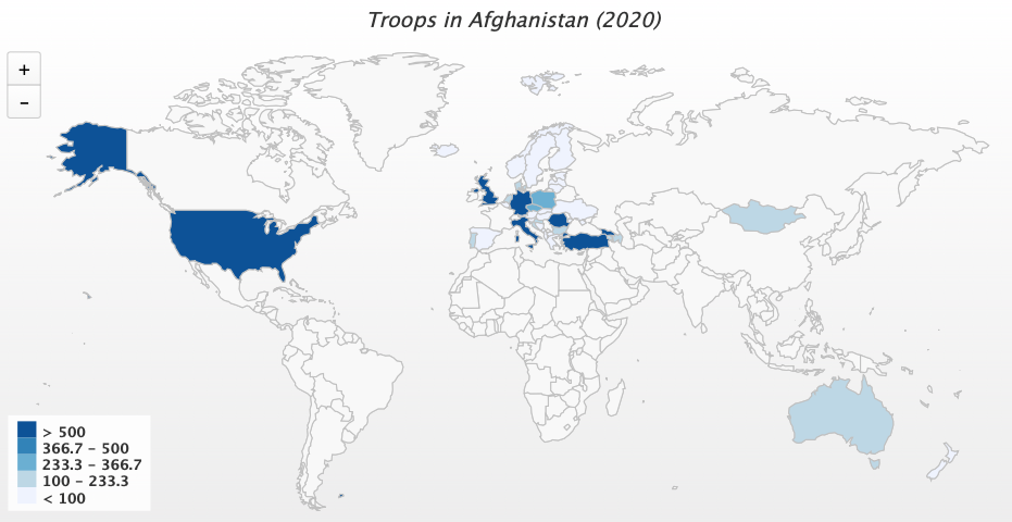 This section includes three maps: Troops in Afghanistan, Wars Present, Drone Strikes.
The first map displays the number of troops from each nation that are taking part in the war on Afghanistan according to NATO. A number of these nations have declared their support for a global ceasefire, but without withdrawing their troops. Over the years, however, some nations have withdrawn their troops. Scroll the map back through time to see nations that used to be in this war but no longer are.
The second map highlights the nations where wars have caused 1,000 or more deaths in the past year according to data from the Uppsala Conflict Data Program displayed at Wikipedia. Go to that link to find smaller wars as well. Scroll this map back through time to see where wars were in previous years.
This map changes considerably from year to year, but the wars are always in the global south, mostly concentrated in North Africa and the Middle East, usually in areas rich in fossil fuels, and never in any of the nations that produce and export most of the weapons for the wars (see weapons maps below).
The third map displays data gathered by the Bureau of Investigative Journalism from Afghanistan, Pakistan, Somalia, and Yemen on U.S. drone “strikes.” Unlike all the other maps, this data is cumulative. That is to say, the figure of 13,072 drone strikes on Afghanistan for 2020 is the total number over the past several years.
But, notice that the total by 2019 was 5,888. This means that drone strikes on Afghanistan in the past year have exceeded those of all previous years combined. We also see a major increase in Somalia. In contrast, since the number for Pakistan is unchanged from 2019 to 2020, there have been no drone strikes recorded there in the past year.
The reason the data for this map does not come from the U.S. government which surely knows it, is that the U.S. government does not provide such data to the public; this data has to be obtained by journalists working in the nations where people are being blown up.
Weapons
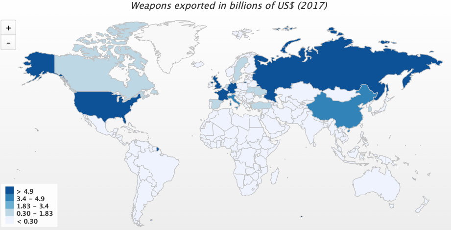 This topic contains eight maps. The source for the data in them is the U.S. State Department, which relies on data from the World Bank and the United Nations Statistical Division. The disadvantage with this source is any lack of trust with it, but the advantage is that the incredibly damning information cannot be questioned by the primary guilty party, since it provided the data itself. The latest data, new in 2020, is from 2017. About the eight maps:
Weapons Exported. This map provides the billions of U.S. dollars worth of weapons exported in 2017 from each country. The United States so dominates the field that it made sense to include the next map displaying percentages. Note that exports under $50 million are recorded as $0 because not provided by the State Department, so some of the nations listed at $0 are actually above that yet dealing in small change relative to the big weapons dealers of the world.
Weapons Exported as Percentage. This map shows what percentage of total global weapons exports was exported by each country. The United States was 78.5%. No other nation even reached 5%.
Weapons Exported to the Poorest Countries. This map provides the billions of U.S. dollars worth of weapons exported from each nation to the poorest quintile of nations on earth.
Weapons Exported to Poorest Countries as Percentage. The United States covers 43%, China 24%, Russia 19%.
Weapons Exported to the Least Democratic Countries. This map provides the billions of U.S. dollars worth of weapons exported to the least democratic quintile of nations on earth. Remember that this is data developed by the U.S. government and published without shame. (See also maps below on oppressive governments’ militaries armed, trained, and funded by the United States.)
Weapons Exported to Least Democratic Countries as Percentage. The United States accounts for 66%, the UK 11%, Russia 11%, China 9%, Germany 2%.
Weapons Exported to Middle East. This violent region produces very few weapons itself.
Weapons Exported to Middle East as Percentage. The United States accounts for 70 percent, the U.K. 11 percent, China 4 percent, Russia 3 percent, Germany 3 percent, France 2 percent, Italy 2 percent.
US Weapons
This topic includes four maps that help us see just where the weapons of the world’s dominant weapons dealer go.
U.S. Weapons Imported 2015-2019. This map simply colors in the nations that have imported any weapons, whether a small or large amount, from the United States during these years. The source of this data is the Stockholm International Peace Research Institute (SIPRI), where you can look for more detail. Notice that most of the world is covered. But note that this data does not include exports to anything that isn’t a nation, such as NATO or rebels trying to overthrow the government of Syria.
The next three maps draw on research done for a recent book and documented in detail in this article. They are:
Oppressive Governments Given or Sold U.S. Weapons 2010 to 2019.
Oppressive Governments Given U.S. Military Training 2017 to 2018.
Oppressive Governments Given U.S. Military Funding 2017 to 2019.
Almost all oppressive governments have the support of the U.S. government.
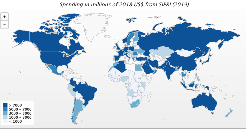
Money
This critical topic includes only one map but adds new data to it for each year from 2015 to 2019.
Spending in Millions of 2018 U.S. Dollars. This map shows the millions of dollars spent by each nation on militarism in each year. The data is all in constant 2018 dollars and exchange rates. The data all comes from SIPRI, which provides data up through 2019, whereas the U.S. State Department provides similar data only up through 2017. To compare that State Department data go here.
The $718,689,000,000 figure for 2019 U.S. military spending that SIPRI provides falls far short of the $1,250,000,000,000 that the U.S. government is actually spending on militarism when all agencies and departments are included, yet the maps still show a striking contrast between U.S. spending and that by all other nations.
One explanation for why the U.S. government seems so incapable of addressing the coronavirus threat while generally being credited with very professionally holding off the Russian, Iranian, Chinese, and North Korean menaces may be that the latter are imaginary. Russian military spending, which went down two of the past three years, is 8.9% of U.S. military spending. Iranian is at 1.3%. China is at 37%. Data is unavailable on North Korea, but its spending is a small fraction of that by the U.S.
Meanwhile, Venezuela, as of 2017 (the most recent year with data), was at 0.001% of U.S. spending that year. As SIPRI has noted, global military spending increased significantly in 2019. Thus far in 2020 that trend seems to be continuing. Military spending by NATO members, led by Germany with the largest increase, has been up in recent years, following public badgering by U.S. President Donald Trump to spend more.
 Nukes
Nukes
This topic includes only one map, with data from 2014 to 2020. The source of the data is the Federation of American Scientists. Here’s the map:
Number of Nuclear Warheads. This map shows numbers of nuclear weapons possessed by each nation to the extent known. This number is one critical measure, but it is important to bear in mind that many of these weapons are vastly larger than were nuclear weapons of the past, while others are smaller and terrifyingly described by the U.S. government as “more usable.”
The Federation of American Scientists notes: “The number of nuclear weapons in the world has declined significantly since the Cold War: down from a peak of approximately 70,300 in 1986 to an estimated 13,410 in early-2020. Government officials often portray that accomplishment as a result of current or recent arms control agreements, but the overwhelming portion of the reduction happened in the 1990s.
Some also compare today’s numbers with that of the 1950s, but that is like comparing apples and oranges; today’s forces are vastly more capable. The pace of reduction has slowed significantly compared with the 1990s. Instead of planning for nuclear disarmament, the nuclear-armed states appear to plan to retain large arsenals for the indefinite future, are adding new nuclear weapons, and are increasing the role that such weapons play in their national strategies.”
Chemical & Biological
This topic contains only one map with data from 2014 to 2020:
Chemical and/or Biological Weapons Possessed. This map simply colors in the nations most likely (there are many uncertainties and dueling allegations) to possess any chemical or biological weapons. Here is a source. As pointed out in a recent article, the coronavirus may not have come from a lab but certainly exposes the danger posed to humanity by the work being done in labs.
US Military
This topic includes four maps that help us visualize the militarism of the world’s leading militarist:
U.S. Bases Present. This map provides the number of U.S. bases in each nation on earth. The data comes from a new source this year, which may account for some of the variation between the 2020 data and the 2019 data that can be displayed on the map. The source is a List of U.S. Bases Abroad, compiled by David Vine.
It is important to go to that source to understand details and uncertainties, and to find bases on tiny islands and other places too small to show up on the maps. This is very much a work in progress. The information is not provided by, and some believe not even fully known by anyone in, the U.S. government. If you have information to add, please contact us.
U.S. Troops Present. This map uses U.S. military data to display the number of U.S. troops openly admitted to being “permanently” based in each nation of the globe. This does not include troops taking part in wars or actions not labeled wars. Missing are “special” forces as well as the largely Navy personnel in Armed Forces Europe and Armed Forces Pacific. Missing is the CIA. Not counted are mercenaries and contractors.
Not displayable on the map are 8,471 troops listed by the U.S. military at the link above as being in “unknown” locations. We have added the 8,000 figure for Afghanistan from the map on troops in Afghanistan above, as well as 5,800 for Iraq and 5,800 for Syria based on this report.
NATO Membership. This map simply colors in the nations that are NATO members according to NATO. Not included are non-member partners.
U.S. Wars and Interventions Since 1945. It’s revealing to look at a map of all the places that the U.S. military has gone to fight at least once since 1945. For more detail go here.
Air Strikes
This topic includes only one map to display data on a handful of nations for which the U.S. military provides reports on its air strikes.
U.S. and Allies Air Strikes. The data is not cumulative. The number provided for a given year and country is the number of air strikes in that year alone. But the data does not distinguish between Iraq and Syria, treating the bombing of both nations as part of a single operation. So, the data for both of those nations is listed in both of them — which should not be interpreted to double the number of strikes.
These numbers, in the thousands, require some imagination to understand as each indicating a horrific bombing. It may aid the imagination to picture the same number of “air strikes” in one’s own part of the world.
Law
This topic includes three maps indicating particular steps taken by some nations to uphold the rule of law:
Member of International Criminal Court.
Party to Convention on Cluster Munitions.
Promotes Peace & Security
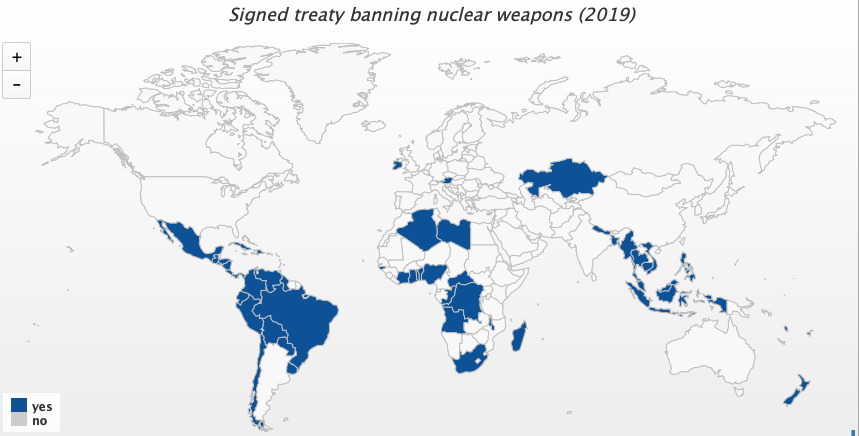 This topic adds three additional maps indicating further particular steps some nations have taken toward peace and security, or — indeed — survival:
Signed Treaty Banning Nuclear Weapons.
Residents Have Signed World BEYOND War’s Declaration of Peace. It’s almost every nation now. You can read or sign it here.
Additional steps toward peace could easily be mapped. Let us know what you’d most like to see added in 2021! We’ve dropped the Good Country Index ranking, as that index no longer includes any ranking clearly about acting for peace and against war. We also find the Global Peace Index to be off-topic as it lumps peace in with numerous other factors, resulting in the worst warmongers scoring relatively well. In place of a numerical ranking, we offer the above collection of maps.
David Swanson is an author, activist, journalist and radio host. He is co-founder and executive director of WorldBeyondWar.org and campaign coordinator for RootsAction.org. Swanson’s books include “War Is A Lie.” He blogs at DavidSwanson.org and WarIsACrime.org. He hosts Talk Nation Radio. He is a Nobel Peace Prize nominee, and was awarded the 2018 Peace Prize by the U.S. Peace Memorial Foundation. Longer bio and photos and videos here. Follow him on Twitter: @davidcnswanson and FaceBook.
This article is from World BEYOND War
>>Please Donate to CNs’ 25th Anniversary Spring Fund Drive<<
Militarism is strongly associated with men, women in distinctive uniforms and equipment, engaged in warfare, but is there not a less visible component that without it militarism could not exist, regimentation of society?
Militarism needs organizational skills, controls over each and every facet from entry, and in todays US, seperation until death.
No other nation in history has been as capable of militarizing its societies since city state of ancient Sparta, as has been done within US.
The excess wealth of US has instilled an acceptance of militarism as can partially be shown by one prime example; the hundreds of Billions yearly paid out to support those who are completely unnecessary to its standing military forces, it’s military veteran and spouces , and the spouses and children of active duty personel.
Another point can be the unnessary hiring advantages granted to ex military, (active military spouces), within every form of Federal, State, county, and city government, especially in Police, Law, and Justice, employ over non military citizens.
Today the yearly salary of a three years active military non officer , married and living off of military post, is higher than 49% of non military man and wife; with medical benefits that non military cannot afford or access.
Then there are other benefits paid for that benefit the nations highest average laborers wages of those employed by what is called military Industrials, and all their smaller infrastructure of supply chains.
From before school entrance an then further enhancements by non educators, teachers, throughout 12 -20 years of schooling, they recieve indoctrination that they owe their freedoms to military.
Another case in point is that of people deemed “non essential” were sent home to die or cure themselves, while all persons within military or its supply chain were deemed “essential”.
Militarism depends upon a well regimented society, a society that no matter ones occupation, it is the Government, and its forces as being “Supremely Essential” in its publics eyes.
This is a very important article – the U.S. federal government & Pentagon are malignant cancers on the U.S. economy, on the U.S. as a country, and on the world. We need to figure out how to de-fund them – for the sake of human progress worldwide, and to protect our children.
wearemany (dot) com/learn/tax-resisting/ :
” ‘Let them march all they want as long as they continue to pay their taxes’, quote attributed to US Secretary of State Alexander Haig in response to the 1982 demonstrations against the nuclear arms race in New York City.
In 1849, after being imprisoned for withholding his taxes, Henry David Thoreau said that ‘if a thousand men were not to pay their tax-bills this year, that would not be a violent and bloody measure, as it would be to pay them, and enable the State to commit violence and shed innocent blood’. “
Mr. Swanson – well done. This is a powerful compilation of the relationship between war and wealth. Can anyone explain with a straight face why we, the US of A, would be in the business of arms and war if not simply for profit… an explanation that would pass the straight face test?
As Ike warned back in January, 1960, we should beware of the Military Industrial Complex. And the MIC essentially runs the country.
I’m sickened to my soul.